Pick your game's base resolution first (320x180 scales cleanly to every 16:9 display), then size sprites to fit it: 16x16 for speed and charm, 32x32 for the indie sweet spot, 48-64px only if you have an animation budget. Every doubling of sprite size roughly quadruples the work, and animation multiplies it again. When in doubt, go smaller.
Every pixel art project starts with the same question, and most people answer it backwards. They pick a sprite size that looks nice in a tutorial, draw a character, and only later discover it does not fit their tile grid, their screen resolution, or the number of animation frames they can actually produce.
Canvas size is not a style choice. It is a budget. This is how to set it deliberately.
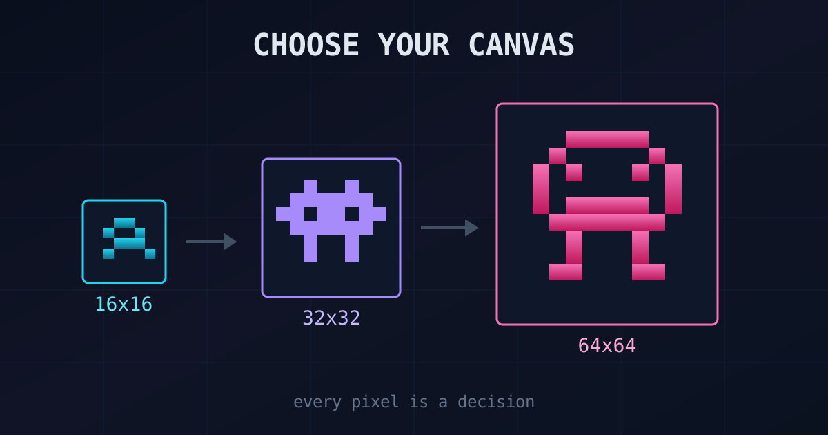
Where the Standard Sizes Come From
The familiar sizes are not arbitrary. They are hardware history. The NES could only draw 8x8 or 8x16 sprites, so Mario is literally several small sprites glued together. The SNES stepped up to sizes from 8x8 through 64x64, which is why 16-bit era characters feel like the size modern indie games still imitate.
Those limits are gone, but the sizes stuck, for a good reason: they divide evenly into each other and into tile grids. A 16x16 tile grid holds 16x16 items, 16x32 characters, and 32x32 bosses without anything falling off-grid.
| Canvas | What fits | Typical use |
|---|---|---|
| 8x8 | Silhouette only | Retro minimalism, icons, bullets |
| 16x16 | Readable character, ~1px facial features | Items, tiles, small characters |
| 32x32 | Clear humanoid with a face | Most indie game characters |
| 48-64px | Expressive poses, detailed costume | Hero characters, big teams |
| 128px+ | Full illustration detail | Portraits and showcase art, rarely games |
The readability floor matters more than beginners expect. At 32x32 a humanoid gets a head around 8 pixels tall, enough for eyes and expression. At 16x16 the whole face is a pixel or two, and the sprite reads by silhouette and color. Neither is worse; they are different disciplines.
Resolution First, Sprites Second
The single best habit: choose your game's base resolution before you draw anything, and choose one that integer-scales to real displays.
The workhorse is 320x180. It is exactly 16:9, so it scales 6x to 1080p, 8x to 1440p, and 12x to 4K with every pixel staying a crisp square. Celeste renders its camera at 320x180 with 8x8 tiles, which gives it 40 tiles of level geometry across the screen. Its sequel-in-spirit competitors mostly made the same call. If you want larger sprites on screen, 640x360 scales 3x to 1080p and works the same way.
Break this rule and you pay for it forever. Shovel Knight chose 400x240 to honor the NES's 240-line height, which means each game pixel is a non-integer 4.5 real pixels at 1080p, something Yacht Club spent real engineering effort making look acceptable. They knew the tradeoff and took it deliberately. You should not take it by accident.
Once the resolution is set, sprite size follows from a simple question: how much of the world do you want visible? At 320x180 with 32x32 characters, your hero is about a fifth of the screen height, which feels like an action game. The same character at 16x16 feels like a zoomed-out RPG. Sketch a mock screen before you commit; it is thirty minutes that saves months.
If any of this scaling talk is new, the pixel-perfect scaling guide explains why integer factors and nearest-neighbor filtering are non-negotiable.
The Cost Curve Nobody Warns You About
Here is the trap. A 32x32 sprite has four times the pixels of a 16x16 sprite. A 64x64 has sixteen times. And pixel art cost tracks pixel count almost linearly, because at this scale every pixel is a placed decision, not a brush stroke.
Then animation multiplies it. A character needs an idle, a walk, a jump, attacks, a hurt state. As one resolution guide puts it, a 16px character can be animated in an evening; a 64px character with the same move set is a week. Multiply by every enemy, NPC, and boss in your design document and the canvas decision becomes the single biggest line item in your art budget.
This is why experienced artists preach starting small. Pedro Medeiros, the artist behind Celeste's sprites, has dozens of tutorials built around economy: fewer pixels, fewer colors, stronger reads. Small canvases teach you to spend pixels where they matter, and that skill transfers up. Working large first teaches you nothing about pixel art that digital painting would not teach better.
The Dead Cells exception. Dead Cells looks like high-detail pixel art with impossibly smooth animation. It is actually 3D models rendered tiny without antialiasing, a pipeline the team built precisely because hand-animating ~50px characters at that quality was not affordable. If your design demands big, fluid sprites, that is the honest price tag.
Keep One Density, Everywhere
The fastest way to make good pixel art look amateur is mixing resolutions, what artists call "mixels." A 32x32 character standing on 16x16 tiles is fine, because both share the same pixel density. A character drawn at 64x64 and scaled down next to native 16x16 tiles is not, because the pixel sizes visibly disagree. Rotating or scaling an individual sprite at runtime breaks the grid the same way.
Medeiros is blunt about it in his consistency guide: pick one resolution and keep it. The one legal exception is strict separation by layer. Celeste pairs pixel art gameplay with smooth high-resolution UI and it works because the two styles never blend, never overlap ambiguously, and never scale against each other.
Practical rules that fall out of this:
- One pixel density per visual layer. All world art shares a grid. UI may use another, but then all UI shares that one.
- Different asset sizes are fine; different densities are not. 16px items plus 32px characters plus 48px bosses is one family.
- Scale the whole screen, never individual sprites. Zoom happens on the camera, at integer factors.
- Decide density before outsourcing or buying assets. Mixed-density purchased packs are the most common source of mixels. Our free assets guide covers what to check before you download.
Picking Your Size, Honestly
| You are... | Draw characters at | Base resolution |
|---|---|---|
| New to pixel art | 16x16 | 320x180 |
| Comfortable, making a solo game | 32x32 | 320x180 |
| Experienced, with time or a team | 48x48 to 64x64 | 640x360 |
| Chasing Dead Cells fidelity | Reconsider, or 3D | 640x360 |
If you are between two sizes, take the smaller one. A finished game of confident 16x16 sprites beats an abandoned folder of half-polished 64x64 heroes, and shipping small is how every artist you admire got good enough to work big.
A good way to calibrate is to study finished work at your target size. Load real sheets into the sprite sheet splitter, measure the cells, and see how much detail actual games spend at 16 or 32 pixels. The guide to studying sprite sheets turns that into a repeatable habit.
Test your size before you commit.
Draw one character at two candidate sizes in the pixel art editor, drop both into sprite sheets, and preview them animated side by side. The right answer is usually obvious in minutes.
The Short Version
Resolution first: 320x180 or 640x360, integer-scaled, nearest-neighbor. Sprites second: 16x16 to learn and move fast, 32x32 for most indie games, 64x64 only with a real animation budget, because doubling the canvas quadruples the work. One pixel density across the whole game, no exceptions you did not choose on purpose. Then build your sheets with the sprite sheet creator and check the motion in the animation preview before you draw the next ten characters.