Recolor & Palette Swap
Shift the hue, swap the palette, get a second enemy colour without redrawing a single frame.
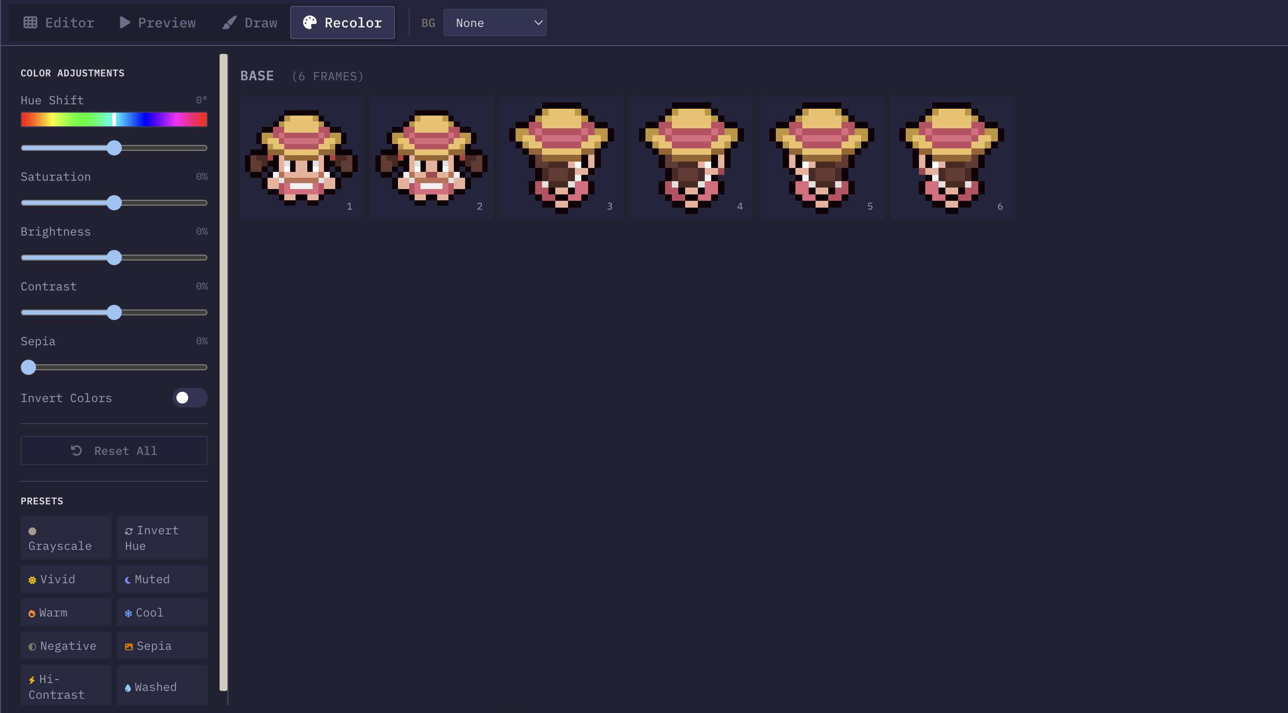
Two ways to recolor
The sprite recolor tool works two ways. Overview mode pushes hue, saturation, brightness, contrast, and sepia across every frame at once, and the preview updates while you drag. Per-frame mode is the precise one: click a sprite, see the actual list of colours in it, and replace them one at a time. Apply that swap to the single frame, or push it through the whole layer.
Global adjustments
Hue shift (-180° to +180°), saturation, brightness, contrast, and sepia, each with a dedicated slider and real-time preview.
Visual hue picker
Click a point on the rainbow bar to jump to that hue angle. Drag along it if you would rather hunt for the right one.
Per-color mapping
Open a frame and its full palette is listed out. Click the colour you want gone, pick the one that replaces it.
Invert & sepia
An invert toggle and a sepia slider. Stack either on top of a hue shift when the result should not look like a filter preset.
10 presets
Grayscale, Invert Hue, Vivid, Muted, Warm, Cool, Negative, Sepia, Hi-Contrast, and Washed. One click each.
Apply to all frames
Got the swap right on one frame? One button pushes it through the rest of the layer.
Palette swaps are how games got their variety
The technique is as old as sprite hardware. Early consoles could not afford a second set of frames for a stronger enemy, so they pointed the same sprite at a different palette and shipped a red one alongside the green one. Players read it instantly: same shape, different colour, expect a harder fight. Team colours in a multiplayer game, seasonal reskins, elite variants, and the classic first act enemy that returns tinted purple are all the same trick.
The economics still hold. A recolor costs seconds and a redraw costs an afternoon, so a recolor is what you reach for when the content needs to double in size and the art budget does not.
Global filters versus per colour mapping
The global controls treat the sheet as an image and push hue, saturation, brightness, contrast, and sepia across every frame at once. This is the fast route. Drag the hue slider and the entire character rotates around the colour wheel with the relationships between its colours intact, which is why the result still looks like art rather than a paint spill. A shift of about 180 degrees takes blue to orange, roughly 120 takes it to green, and the preview follows your drag so you can stop where it looks right.
Per colour mapping is the surgical route. Open a frame and its actual palette is listed out, every distinct colour in the image. Click one, choose what replaces it, and only that colour changes. This is what you need when a hue rotation would drag something along that should not move, most often skin tones, metal, or a white highlight that turns a shade of green nobody wanted.
The two combine well. Rotate the hue to get most of the way there, then map the two or three colours the rotation ruined back to something sensible.
When a swap fights back
Two things that fight a recolor
- Shared colour: the armour and the boots both use the same blue because that is efficient painting, so recoloring the armour recolors the boots. Nothing in a filter can separate them, because in the pixels they are not separate. The fix is to split them first: change one of the two to a near neighbour in the pixel editor, then map the two colours independently.
- Contrast collapse: rotating hue keeps lightness, so a palette that relied on a dark blue reading against a mid grey may end up with two colours of nearly the same value, and the sprite goes flat at small sizes. Check a recolor at the size it will actually be drawn, not zoomed in, and lean on the brightness and contrast sliders to pull the values back apart.
Building and keeping a set of variants
Work one variant at a time. Get the swap right on a single frame, judge it, then push it through the rest of the layer in one action so every frame agrees. Export that version, reset the adjustments, and start the next one from the original art rather than from the last variant, which keeps small errors from stacking up across a family of five enemies.
Global adjustments are non destructive and reset with one click, so the original frames survive any amount of experimenting. Per frame mappings commit when you apply them, and the editor history is the way back if one was a mistake. Either way the settings ride along in a saved project, a share link, and a cloud save, so a variant can be reopened later and adjusted rather than rebuilt from memory.
Presets as a starting point, not an answer
The ten presets cover the recolors that come up most: grayscale for a petrified or disabled state, inverted hue for a straight opposite, vivid and muted for pushing or pulling intensity, warm and cool for time of day variants, negative and sepia for effects, plus high contrast and washed for readability extremes.
Treat them as a first move. Click the one closest to what you want, then adjust from there with the individual sliders, because a preset knows nothing about your palette. Grayscale on a sprite that relied on colour rather than value contrast comes out flat, and the fix is a contrast nudge that no preset can guess.
Status effects in two clicks
A useful pattern for status effects: grayscale plus a small brightness lift reads as frozen or stunned in almost any art style, and a warm shift with raised contrast reads as burning. Both are two clicks and neither costs a frame of new art.
More questions? See the full FAQ.
Recolor your sprites
Shift a hue, swap a palette, and keep the original frames untouched.
Open the editor