Pixel art looks like pixel art because of the palette, not the pixel grid. A small, deliberate set of colors reads clearly at tiny sizes and keeps every frame consistent. Two ideas do the heavy lifting: hue shifting (warm highlights, cool shadows) and value (light versus dark). Once a palette is right, a palette swap lets you reuse one set of frames as many color variants, which is how a single enemy becomes a whole difficulty ladder. The editor's Recolor tab does both the tuning and the swap.
Why a Limited Palette
A photograph uses millions of colors. Pixel art uses maybe a dozen. That is not a technical limit, it is a design decision.
At 32x32, every color you add has to earn its pixels. A single sprite with forty colors turns to noise when it is thirty pixels tall, because the eye cannot tell adjacent shades apart at that size. A sprite with eight well-chosen colors stays readable. Fewer colors also means every frame shares the same set, so an animation does not shimmer as colors pop in and out between poses.
Most working palettes follow the same skeleton:
- A base color for each material (skin, cloth, metal).
- A shadow version, darker and shifted cooler.
- A highlight version, lighter and shifted warmer.
- Maybe an outline color, usually near-black or the darkest shadow.
That is three shades per material, and it is enough for almost anything a sprite sheet holds.
Hue Shifting: Make Shadows Cool, Highlights Warm
The beginner instinct is to shade by darkening the base color toward black and lightening it toward white. That works, but it looks flat. The professional trick is hue shifting: as a color gets darker, it also moves around the color wheel.
The classic rule: shadows shift toward blue or purple, highlights shift toward yellow or orange. A red shirt is not shaded with darker red, it is shaded with a deep purple-red and highlighted with a warm orange-red. A green leaf shades toward blue-green and highlights toward yellow-green.
Why it looks better: light in the real world is warm (sun) and shadow is cool (sky bounce), so your eye has already learned to read warm-cools as depth. A palette that ignores hue shifting looks like a colorize job; one that uses it looks painted.
You do not need to memorize the wheel. Hold this rule: never shade by only changing brightness. Move the hue at least a little every time you move the value.
Value Does the Work
Hue is the flavor; value (light versus dark) is the structure. Squint at your sprite until it blurs, and what you see is value. If the character does not read as a shape when blurred, the values are too close together, no matter how nice the colors are.
The quick test: convert your sheet to grayscale and check whether the silhouette still pops. If it does, the palette is sound. If it turns into mud, two of your materials are too close in value and need to separate.
The editor makes this test one click. The Grayscale preset in the Recolor tab drops saturation to zero so you can judge value in isolation, then reset when you are done.
The Palette Swap: One Sheet, Many Characters
This is the payoff of a disciplined palette, and it is the oldest trick in game art. You draw one character, then remap its colors to make every other character: the red enemy becomes green, then purple, then gold, with zero new drawing.
Old hardware did this in hardware. The NES did not store a green enemy and a red enemy, it stored one enemy and swapped the palette table at runtime. You can do the same thing in your asset pipeline: keep one set of frames and export recolored copies for each variant.
A palette swap is not a hue filter. A hue filter rotates every color blindly and loses the careful hue-shifting you put in. A swap is deliberate: each color in the source palette maps to a chosen color in the target palette, so the shading relationships survive. The red shirt's purple shadow becomes the green shirt's blue shadow, and the whole character still reads as one material.
The most useful swaps are the ones where the target palette obeys the same rules as the source: same number of shades per material, same value step between them, same warm-highlight cool-shadow direction. Swap to a palette with the same structure and the result looks hand-drawn, not filtered.
Tuning a Palette in the Recolor Tab
The editor's Recolor tab has two levels, and they match the two jobs above.
The live filter is the tuning tool. It applies non-destructive shifts across every frame at once while you drag, so you can explore without committing anything:
- Hue shift rotates the whole palette around the wheel. This is how you preview "what if the hero were blue".
- Saturation pushes colors toward vivid or toward gray.
- Brightness and Contrast adjust the value range.
- Sepia and Invert are the quick stylization moves.
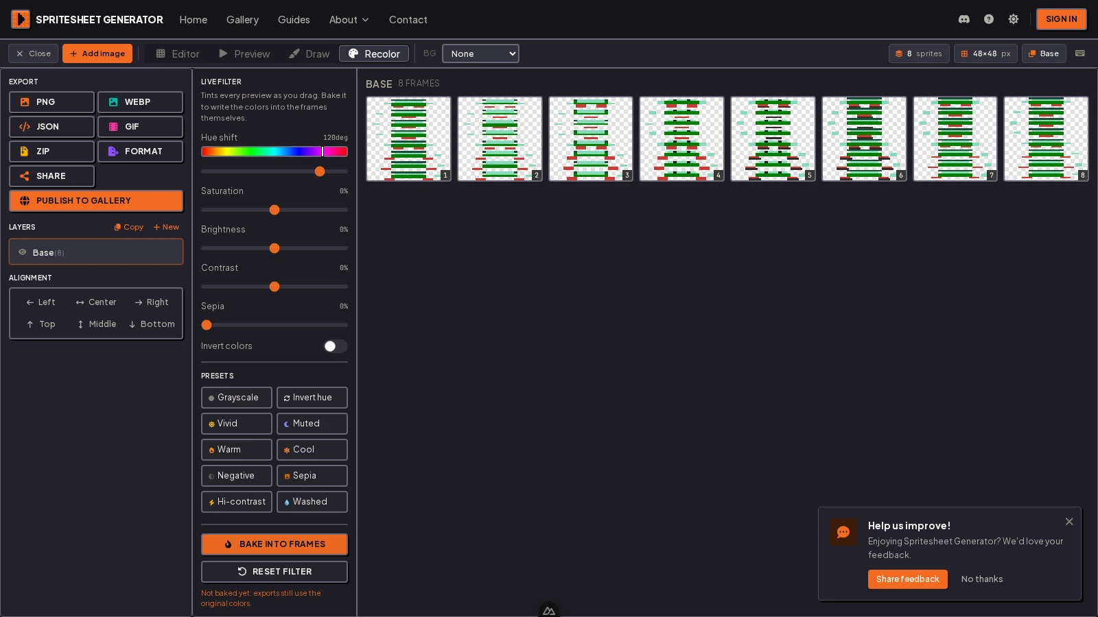
The filter is a preview until you Bake into frames, which writes the new colors into the actual pixels. Explore with the filter, commit with the bake, and keep a copy of the original sheet so you can always come back.
The live filter is non-destructive by design, and exports still use the original colors until you bake. If you export a sheet that looked recolored on screen but forgot to bake, you ship the unshifted art. Watch for the "not baked yet" hint in the panel.
Swapping Specific Colors with the Color Map
The live filter moves the whole palette. For an actual swap, you want the per-frame color map.
Open any frame in the Recolor tab and the editor lists the colors in that frame, most-used first. Each row shows the original color, an arrow, and a new color you pick. Change just the shirt color and the shirt recolors everywhere it appears, while the skin, hair, and pants stay untouched.
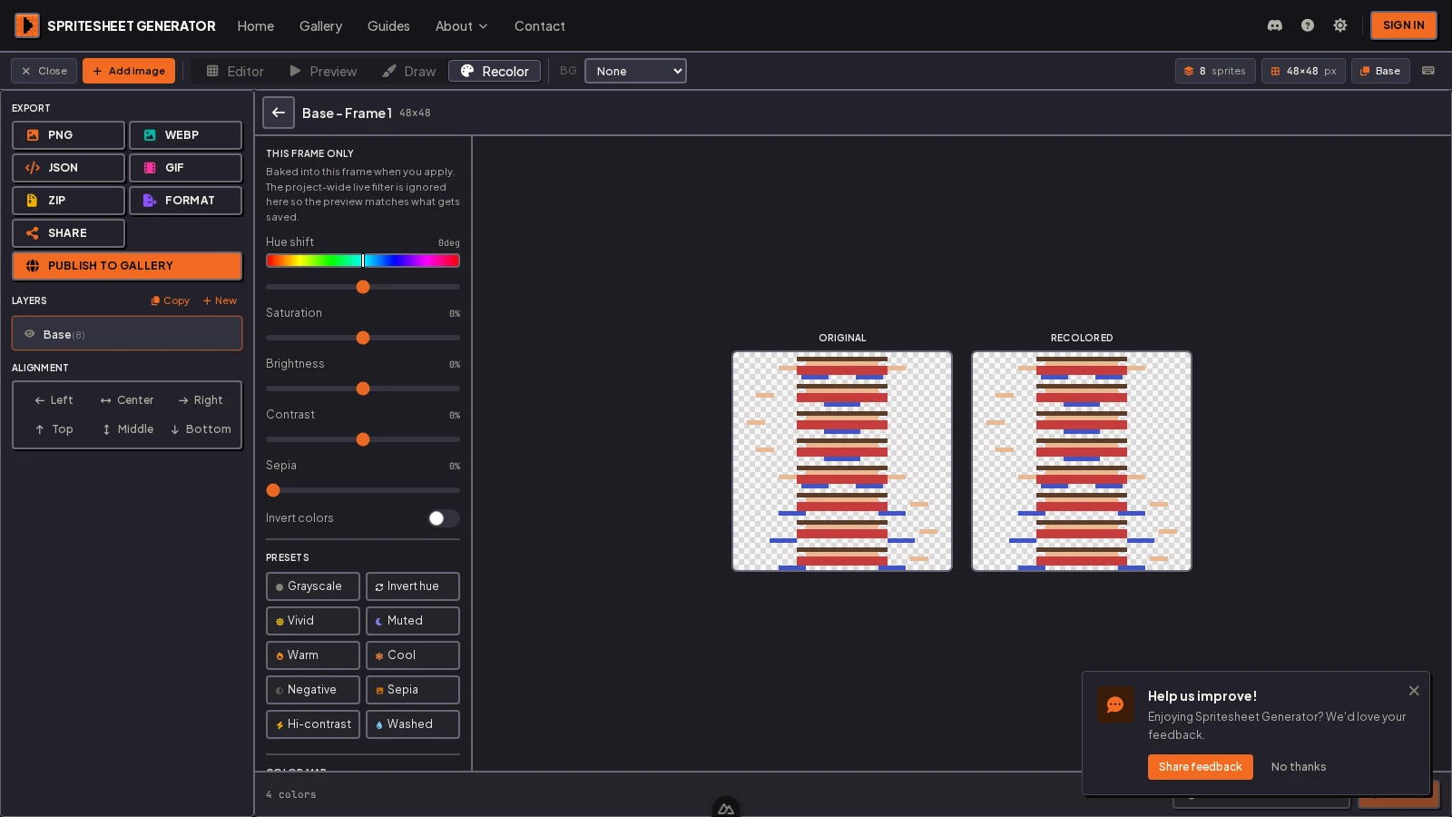
Then the key step: Apply to all frames. The editor walks every frame in the layer and remaps the same colors, so one careful swap becomes a fully recolored animation. This is the exact mechanism of a palette swap, done after the fact instead of in a palette editor.
How to build a variant set. Draw and animate the hero in one palette. Open the Recolor tab, remap the shirt and skin colors to the enemy's, apply to all frames, and export. Repeat for each variant. One set of frames, as many characters as you have palettes.
A Palette Checklist
Before you call a palette done, run it through this:
- Fewer than three shades per material? If a material has five, the sprite is doing too much.
- Shadows cooler, highlights warmer? If shading only darkens, hue-shift it.
- Reads in grayscale? If the silhouette muds out, fix the value separation.
- Each material distinct in value? Two materials at the same value read as one blob at small size.
- Target palettes share structure? If a swap obeys the same shading rules, it will look intentional.
Five yeses and the palette is doing the work, not the frame count.
Recolor one sheet into as many variants as you need.
Shift the whole palette or remap specific colors across every frame, then export. Free, in the browser, nothing to install.
Questions
How many colors should a pixel art sprite have? Enough for three shades per material, plus an outline. A character usually lands between eight and sixteen. A tile or icon can get away with fewer.
What is hue shifting? Shading that moves hue as it moves value: shadows shift toward blue or purple, highlights toward yellow or orange. It makes shading look painted instead of filtered.
What is a palette swap? Remapping each color in a source palette to a chosen color in a target palette, so one set of frames becomes multiple characters with no new drawing.
Is a palette swap the same as a hue filter? No. A hue filter rotates every color blindly; a swap maps each color deliberately and keeps the shading relationships intact.
How do I recolor every frame at once? In the Recolor tab, remap the colors on one frame, then use Apply to all frames. The editor walks the whole layer and applies the same mapping.
Does the live filter change my exported PNG? Not until you bake it. The live filter is a preview; exports use the original colors until you hit Bake into frames.
Screenshots taken in the Spritesheet Generator editor. Palette and hue-shifting technique follows the shading practice used across 2D game art and pixel art pipelines.
Try it in the editor
Everything in this guide runs in the browser. No install, no account, and your images never leave your device.