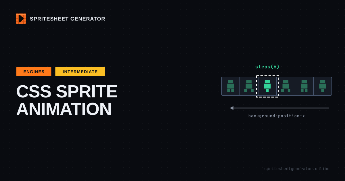
A CSS sprite animation is a box one frame wide with the whole sprite sheet as its background. steps() slides that background one frame at a time instead of gliding, so the box shows each frame in turn. Export your animation as a single horizontal strip, set the box to one frame's size, animate background-position-x, and add image-rendering: pixelated so the art stays sharp when you scale it up. No JavaScript, no canvas, no library.
Why Bother With CSS
Most sprite sheets end up in a game engine. A surprising number end up on a web page instead: a mascot waving on a landing page, a loading spinner, a little character walking across a 404 page, the hover state of a button on an itch.io devlog.
For those, a canvas and a game loop is overkill. CSS can already play a sprite sheet, and it does it with about ten lines. The browser handles timing, it pauses when the tab is hidden, and it works with JavaScript turned off.
How It Works
Picture a strip of eight frames, each 32x32, laid side by side into a 256x32 image. Now picture a 32x32 window sitting over the first frame. Slide the strip 32 pixels to the left and the window shows frame two. Slide it again, frame three.
That window is your element. The strip is its background. Normal CSS animation would slide the background smoothly, which looks like a filmstrip being dragged past the lens. steps(8) changes that: the animation jumps in eight discrete moves and holds still in between. One jump per frame.
Step 1: Export a Strip
The simplest sheet to animate in CSS is one row. Open your frames in the editor, set Columns to the number of frames, and set Padding to 0. Padding is great for game engines that sample textures with filtering (the packing guide explains why), but in CSS it just shifts every frame by a few pixels and breaks the arithmetic.
Export PNG. For an eight-frame 32x32 walk cycle you get a 256x32 file.
Check the animation in the Preview tab first and note the FPS that looks right. You will need that number in a minute, and it is much easier to judge there than by editing CSS and reloading.
Step 2: The Ten Lines
.hero {
  width: 32px;
  height: 32px;
  background: url('hero-walk.png') no-repeat 0 0;
  animation: walk 0.8s steps(8) infinite;
}

@keyframes walk {
  to {
    background-position-x: -256px;
  }
}
That is a working animation. Drop <div class="hero"></div> on a page and the character walks in place.
The duration is frames divided by frame rate: eight frames at 10 fps is 0.8 seconds. A few common combinations:
| Frames | FPS | Duration | Feels like |
|---|---|---|---|
| 4 | 8 | 0.5s |
Slow idle breathing |
| 6 | 12 | 0.5s |
Snappy walk |
| 8 | 10 | 0.8s |
Relaxed walk cycle |
| 8 | 12 | 0.667s |
Standard run |
| 12 | 24 | 0.5s |
Smooth effect, like a flame |
The Off-by-One That Shows the Wrong Frame
Look at the keyframe again. The strip is 256 pixels wide and the last frame starts at x = 224. So why animate to -256 and not -224?
Because the default steps() mode jumps at the end of each interval. With steps(8) the background sits at 0, -32, -64, and so on down to -224, each for one eighth of the duration. The final value, -256, would only show at the exact instant the cycle ends, which is the same instant it restarts at 0. You never see it.
If you animate to -224 with steps(8), every frame ends up 28 pixels off and you get half of one pose glued to half of the next. Animate to -224 with steps(7) and the positions are right but the last frame never appears. Both bugs are common. Both come from the same place.
The rule: animate to -(frames x frame width), the full width of the strip, and use steps(frames). The end position is one frame past the last one, and that is correct.
Scaling Pixel Art Without Blur
A 32x32 sprite is tiny on a modern screen. You want it at 128x128. Make the box four times bigger and scale the background with it:
.hero {
  width: 128px;
  height: 128px;
  background: url('hero-walk.png') no-repeat 0 0 / 1024px 128px;
  image-rendering: pixelated;
  animation: walk 0.8s steps(8) infinite;
}

@keyframes walk {
  to {
    background-position-x: -1024px;
  }
}
image-rendering: pixelated is the important line. Without it the browser smooths the upscale with bilinear filtering and your crisp edges turn to mush. With it, every source pixel becomes a clean 4x4 block. Stick to whole-number scales (2x, 3x, 4x). At 2.5x some pixels come out two screen pixels wide and some three, and the sprite shimmers as it animates. The pixel-perfect scaling guide covers why.
A Version That Does Not Care About Size
Hard-coding -1024px means rewriting the keyframe whenever the scale changes. Percentages avoid that. A background position of 100% lines the right edge of the image up with the right edge of the box, which is exactly where the last frame sits, at any size:
.hero {
  width: 128px;
  height: 128px;
  background: url('hero-walk.png') no-repeat 0 0 / 800% 100%;
  image-rendering: pixelated;
  animation: walk 0.8s steps(8, jump-none) infinite;
}

@keyframes walk {
  to {
    background-position-x: 100%;
  }
}
Two things changed. 800% 100% sizes the background to eight boxes wide (eight frames) and one box tall. And jump-none tells steps() to land on both the first and the last value, so eight steps give eight frames from 0% to 100% with no frame past the end. Change the box to 64px or 256px and nothing else needs touching.
Switching Animations With a Class
A character usually has more than one animation. Put them on one sheet, one row each, all the same width:
| Row | Animation | y offset (32px frames) |
|---|---|---|
| 1 | Idle | 0 |
| 2 | Walk | -32px |
| 3 | Jump | -64px |
Then animate only the x axis and pick the row with a class:
.hero {
  width: 32px;
  height: 32px;
  background: url('hero.png') no-repeat 0 0;
  animation: cycle 0.8s steps(8) infinite;
}

.hero.is-walking {
  background-position-y: -32px;
}

.hero.is-jumping {
  background-position-y: -64px;
}

@keyframes cycle {
  to {
    background-position-x: -256px;
  }
}
This is why the keyframes say background-position-x rather than background-position. The shorthand sets both axes, so the animation would stomp on the row you picked with the class and pin it back to the top.
The catch: every row has to have the same frame count for one shared keyframe to work. If idle has four frames and walk has eight, give each class its own animation line with its own steps() and end position. When you build the sheet in the editor, set Columns to the longest animation so every row starts at x = 0.
Play, Pause, and Reduced Motion
A few small things make a CSS sprite feel like part of the page instead of a GIF stuck on it.
Play on hover only:
.hero {
  animation-play-state: paused;
}

.hero:hover {
  animation-play-state: running;
}
Play once and stop on the last frame, for something like a chest opening:
.chest.is-open {
  animation: open 0.5s steps(6, jump-none) forwards;
}

@keyframes open {
  to {
    background-position-x: -160px; /* last frame of a 6-frame, 32px strip */
  }
}
forwards keeps the final keyframe value after the animation ends. That breaks the earlier rule: with the default step mode and an end position one frame past the strip, the element would freeze on empty space. So for one-shot animations, end on the last frame itself (-(frames - 1) x width) and use jump-none so that frame gets its full share of the duration.
And respect people who have asked their system for less motion:
@media (prefers-reduced-motion: reduce) {
  .hero {
    animation: none;
  }
}
Frame one stays visible, so the character is still there. It just stands still.
What the CSS Export Is For
The export dialog has a CSS Sprites format. It writes a class per frame:
.sprite {
  display: inline-block;
  background: url('spritesheet.png') no-repeat;
  width: 32px;
  height: 32px;
}
.sprite-0 {
  background-position: -0px -0px;
}
.sprite-1 {
  background-position: -32px -0px;
}
.sprite-2 {
  background-position: -64px -0px;
}
That is the classic CSS sprite technique, older than CSS animation itself: one image request for a whole set of icons, each class showing one of them. Use it for static frames like UI icons, item slots, or a health bar with five states. It also works when JavaScript decides which frame shows, for example a frame per scroll position. For a looping animation, the steps() approach above is less code.
When CSS Is the Wrong Tool
Animating background-position repaints the element on every frame change. For one mascot, or ten, that costs nothing you will measure. For a hundred sprites moving around the screen at once, you are building a game, and a canvas library like Phaser or PixiJS will handle it far better. The engine import guide picks up from there.
A middle ground if you need many CSS sprites: put an <img> of the strip inside a box with overflow: hidden and animate transform: translateX() with steps() instead. Transforms run on the compositor, so the browser skips the repaint. The math is identical.
Quick Checklist
- One row, no padding, frames all the same size
steps(frames)and animate to the full strip width, orsteps(frames, jump-none)and100%- Duration = frames / fps
image-rendering: pixelatedand whole-number scales- Animate
background-position-xso classes can pick the row - A
prefers-reduced-motionrule
Build the strip, check the timing, export the PNG. Open the editor
Try it in the editor
Everything in this guide runs in the browser. No install, no account, and your images never leave your device.